
Welcome to the ThingSpeak community site. We’re sharing the IoT. Tell us about your project or ask us about ours.
Welcome to the ThingSpeak Community
Moderator:
Christopher Stapels
The community for students, researchers, and engineers looking to use MATLAB, Simulink, and ThingSpeak for Internet of Things applications. You can find the latest ThingSpeak news, tutorials to jump-start your next IoT project, and a forum to engage in a discussion on your latest cloud-based project. You can see answers to problems other users have solved and share how you solved a problem.
Top Community Contributors


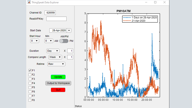
Additional Resources
Blogs
MathWorks Videos
Community Videos
You can also select a web site from the following list
Americas
- América Latina (Español)
- Canada (English)
- United States (English)
Europe
- Belgium (English)
- Denmark (English)
- Deutschland (Deutsch)
- España (Español)
- Finland (English)
- France (Français)
- Ireland (English)
- Italia (Italiano)
- Luxembourg (English)
- Netherlands (English)
- Norway (English)
- Österreich (Deutsch)
- Portugal (English)
- Sweden (English)
- Switzerland
- United Kingdom (English)
Asia Pacific
- Australia (English)
- India (English)
- New Zealand (English)
- 中国
- 日本Japanese (日本語)
- 한국Korean (한국어)